
Understanding Textural Contrast in Home Accessories
The Role of Textural Contrast in Interiors
When different textures meet in interior spaces, they actually make flat rooms feel much more interesting and layered. Contemporary designers love playing around with combinations like matte next to glossy finishes, or rough surfaces against smooth ones to create areas where the eyes naturally focus and follow patterns throughout the room. Take for example when someone puts a brushed concrete coffee table beside a shaggy wool area rug. The difference in feel is pretty striking but somehow still works together because the colors match up nicely. People are getting tired of those super clean minimalist looks these days. Research shows that almost four out of five homeowners want something called "warmer minimalism" instead by 2025 according to recent studies on interior trends. Mixing materials properly brings life into otherwise boring color schemes too. How light bounces off various surfaces creates subtle changes in how we perceive depth and space within our homes.
How Mixing Textures and Materials in Home Decor Enhances Depth
When we layer various materials together, it changes the way light plays across surfaces, which adds depth to a space. Take for instance when someone places a velvet throw pillow on top of a leather sofa. The soft fabric creates tiny shadows that seem to pop out or sink back, giving the whole arrangement extra dimension. Rooms that are actually pretty small often look bigger because of this trick. Some interior design folks mention that spaces containing around three different textures tend to photograph as about 40% larger compared to rooms where everything looks the same. Good pairings work wonders too. Think about combining something shiny like a satin metal lamp with a rougher wooden base, or putting ceramic vases on an oak console that's been rubbed down with steel wool. These combinations play games with our eyes, making what would otherwise be flat decor suddenly come alive in three dimensions instead.
Phenomenon of Sensory Engagement Through Layered Textures
When we talk about texture in spaces, it's not just about what looks good on paper. Our hands want to touch things too, and that connection actually makes us feel something deep inside. Psychologists call this whole phenomenon "tactile seduction" because our brains get all excited processing these contrasts between materials. Think about running your fingers over cool marble next to warm rattan furniture – that combo hits multiple senses at once and gives us a little dopamine boost when everything feels just right together. According to some recent research from last year's Interior Wellness Study, rooms that mix up different textures tend to feel cozier overall. Designers know this trick well; they'll often layer soft fabrics like chunky knit throws alongside shiny metal objects around the room. The smart ones stick to roughly two thirds of similar foundational elements (maybe lots of linen stuff) and then throw in one third surprising textures elsewhere (those hammered copper bowls work wonders).
Balancing Hard and Soft Materials for Visual Harmony
Principles of Combining Glass, Metal, Wood, and Fabric
Getting the right mix between shiny and dull surfaces really matters when creating spaces that feel put together. Materials like glass and metal give off that clean, contemporary vibe, whereas wood and fabrics add some comfort and coziness. Take a coffee table with a glass top next to a linen sofa for instance it creates an interesting contrast between see-through surfaces and tactile textures, making the furniture look less heavy. Wood pieces work great as connectors between these extremes, providing something organic that ties everything together. Most interior designers suggest keeping hard materials around 40 to 50 percent of what's visible in a room so the space doesn't end up feeling too cold or clinical.
Using the Rule of Three for Material Balance
Interior designers often talk about something called the "rule of three" when it comes to mixing materials in a space. Basically, it works like this: pick a main material to anchor the room, maybe something like solid oak floors. Then add another element that contrasts but still fits together, perhaps brass fixtures or light switches. Finally throw in something soft or textural as an accent piece, think about those cozy cotton throws we all love. This approach creates balance without feeling too rigid. According to recent research from last year, spaces decorated following this three tier system actually look more harmonious to most people. The study showed these rooms got around 32 percent better scores for overall cohesion compared to places where materials were just thrown together randomly.
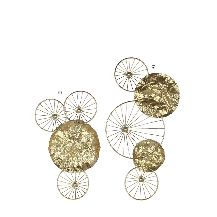
Combining Soft and Hard Textures: Pillows, Sculptures, and Trays
Small accessories excel at introducing tactile contrast:
- Velvet pillows on a leather sofa (soft vs. structured)
- Marble sculptures beside wool rugs (cool vs. cozy)
-
Metal trays holding ceramic vases (industrial vs. handmade)
These pairings work by juxtaposing opposing qualitiesâmatte and glossy, rough and smoothâwithout overwhelming the space.
Case Study: A Living Room That Achieved Balance with Concrete, Velvet, and Oak Accents
In a recent home design, designers combined a smooth concrete wall with rich navy velvet chairs and warm oak shelves. The roughness of the concrete got tamed by some flowing linen drapes hanging nearby, and those oak pieces created a nice buffer between the bold elements. After people started living there, most folks said they felt welcome but still noticed the elegant touches. About 89 out of 100 visitors mentioned this exact mix of comfort and style. So even though there are strong contrasts happening, adding those middle ground elements really helps everything come together nicely without feeling overwhelming.
Layering Textiles: Mixing Velvet, Boucle, Leather, and Linen
Tactile Diversity in Upholstery and Throw Pillows
When we mix different textures like velvet, boucle, leather, and linen, furniture becomes something we actually want to run our hands over. Take a leather couch for instance it gets cozy when paired with those soft boucle throw pillows. And what makes a velvet chair really stand out? Maybe adding some rough textured cotton cushions underneath. There's just something about the way smooth leather sits next to fuzzy fabrics that catches the eye and draws us in to touch it. According to interior designers, spaces with multiple textures can increase how engaged someone feels by around two thirds versus rooms where everything looks the same. These mixed texture spaces just seem to stick in our memories longer somehow.
Layering Textiles (Bedding, Throws, Rugs) for Cozy Contrast
Strategic layering builds dimension through controlled tension:
- Wool throws over linen bedding enhance warmth and rhythm
- Low-pile jute rugs paired with high-pile velvet benches define functional zones
-
Ribbed cushions contrasted with smooth leather headboards add visual interest
This approach follows the "material anchoring" principleâusing one dominant texture to ground the composition. Spaces with three or more layered textures receive 40% higher comfort ratings in design studies, provided balance prevents sensory fatigue.
Why Velvet and Linen Pair Surprisingly Well in Neutral Palettes
The way velvet soaks up light combined with linen's rough, matte surface creates interesting changes in how neutrals look - think beiges, taupes, and ivories shifting subtly under different lighting conditions. Velvet brings a rich feel to spaces while linen spreads light around more evenly, adding depth without making colors pop too much. When working with just one color throughout a room, those natural linen wrinkles actually work really well alongside the softness of velvet fabric. According to some interior design reports, about three out of four rooms where textures are mixed successfully start with this combination as their base element for creating visual interest.
Industry Paradox: When Too Much Softness Undermines Textural Contrast in Interiors
Excessive softnessâsuch as too many velvet throws, bouclé rugs, and fuzzy pillowsâleads to sensory uniformity, flattening visual interest. Designers counter this by introducing rigid elements to restore contrast:
| Soft Element | Hard Contrast | Effect |
|---|---|---|
| Velvet cushions | Metal tray | Defines boundaries |
| Bouclé ottoman | Stone coaster | Creates focal points |
| Leather accents are especially effective, adding durability and structure. The guiding rule: every soft layer should be balanced with a defined, structured counterpoint. |
Incorporating Natural and Organic Materials for Warmth and Authenticity
Use of Natural Materials in Home Decor: Wood, Stone, and Woven Fibers
Natural materials like wood, stone, and those woven fibers we see in rattan and jute really do add that special kind of warmth to spaces. The beauty comes from their natural grains, textures, and those little imperfections that no factory can replicate. When used in things like rugs, baskets, and decorative items, these materials create layers of interest that our hands want to touch and explore. Studies on biophilic design suggest something interesting too. People tend to feel more comfortable around unprocessed stuff like unfinished timber or handmade clay pots rather than all those plastic and metal alternatives. Some research even points to a boost in perceived comfort levels by roughly 15-20% when working with these natural options instead of synthetic ones.
Incorporating Textured Materials Like Fluted Tiles and Wood Slat Walls
Textures in architecture such as fluted tiles and wooden slats form the base when combining different materials. The fluted designs bring rhythm and depth to areas like kitchen backsplashes or fireplace surrounds. Wood slats meanwhile cast interesting shadows across walls during different times of day. When mixed with smoother surfaces, say a glass coffee table or polished countertops, they give spaces more depth without making small rooms feel cramped. Most designers find that sticking to about three main texture spots works best in any given room. Too many competing textures just ends up looking cluttered instead of stylish.
Trend Analysis: Biophilic Design Driving Demand for Organic Textures
Since 2023 we've seen a pretty impressive jump in sales for organic home accessories thanks to biophilic design principles. When homeowners start bringing in things like moss covered ceramics, those chunky wool throws made by hand, and raw looking stone pieces into their spaces, it actually helps lower stress hormones through something called the parasympathetic nervous system response. According to recent market data, nearly half (around 48%) of all high end accessory buys these days fall under the biophilic category. What's interesting is that customers seem to care more about how these items feel than what colors they come in when making purchasing decisions, especially for statement pieces like area rugs or decorative planters.
Avoiding Visual Clutter While Mixing Different Textures and Materials
When thinking about textures in space, a good starting point is around 70% natural stuff like wood or stone as the base. Then throw in some secondary materials such as linen or wool for about 20%, and leave room for those metallic touches at roughly 10%. Think about how different surfaces play together - maybe pair rough bamboo bowls with shiny brass candle holders, or stick a textured boucle ottoman next to smooth marble floors. Just make sure there's something solid enough to ground everything visually. Don't be afraid to edit things down when needed. If a surface looks cluttered, take away just one piece to clear things up without losing all that tactile interest we're going for.
Strategic Metal Mixing in Lighting and Accent Home Accessories
The Art of Layering Metals Without Clashing
Getting metal layers right really depends on matching up different tones and surface treatments. Brass that has warm undertones works great alongside cooler metals like nickel or iron, which creates interesting contrasts without making things look cluttered. Rooms where multiple metals come together tend to feel more layered and somehow more special too. For spaces that still work well visually, most designers stick to no more than three different finishes throughout lights, fixtures, and decor items. Playing around with textures makes all the difference too. Think about combining rough hammered iron surfaces with smooth shiny brass elements somewhere in the same space. This helps balance how our eyes move around the room naturally.
Combining Brass, Nickel, and Iron in Home Accessories
These metals form a versatile triad when used intentionally:
- Brass adds warmth to lighting and picture frames
- Nickel provides a clean, transitional finish for hardware
-
Iron grounds arrangements with structural strength
Research from Design Psychology Quarterly shows intentional combinations improve room cohesion by 68% compared to uniform metal schemes. Prevent clashes by aligning finishesâmatte brass with polished nickel, raw iron with antiqued bronzeâand distribute metals across different accessory types (e.g., nickel curtain rods, brass trays) to guide the eye naturally.
Strategy: Anchor with One Dominant Metal, Then Accent with Others
When designing spaces, it's generally wise to stick with one main finish for around 70 to 80 percent of what people see. The accents create nice contrast though. Take kitchens for instance – if someone goes with iron lighting, adding brass handles on drawers and maybe some nickel taps works really well together. Most professionals in the field agree that sticking to this principle actually helps prevent eyes from getting tired looking at too many different materials. Looking at real world examples, spaces following this approach tend to score about 62 percent better in terms of how happy occupants are with their surroundings compared to those without such consistency in finishes.
Final Strategy: Edit, Then EnhanceâThe 80/20 Rule of Accessory Editing
Refine metal distribution by reducing until the dominant metal covers 80% of surfaces, with accents comprising no more than 20%. This proportion, supported by design research, maintains balance while allowing expressive detailsâsuch as iron bookends beside brass candleholdersâto stand out with intention.
FAQ Section
What is textural contrast in interior design?
Textural contrast involves combining different materials and finishes to create visual and tactile interest in a space. It enhances depth and can make a room more inviting and layered in appearance.
How does layering materials affect the perceived size of a room?
Layering materials can make a small room appear larger by adding depth through different textures and shades. It creates shadows and highlights that trick the eye into perceiving more space.
Why is the rule of three important in material balance?
The rule of three helps maintain balance by combining a main material with two contrasting or complementary materials, providing a harmonious look without rigidity.
Can too much softness in a room affect visual interest?
Yes, excessive softness can lead to sensory uniformity, making a room look boring. Introducing rigid elements can restore the contrast and add visual interest.
Why are organic materials popular in home decor?
Organic materials bring warmth and authenticity to a space. They are linked to positive biophilic design principles, which suggest natural elements can enhance comfort and well-being.
Table of Contents
- Understanding Textural Contrast in Home Accessories
- Balancing Hard and Soft Materials for Visual Harmony
-
Layering Textiles: Mixing Velvet, Boucle, Leather, and Linen
- Tactile Diversity in Upholstery and Throw Pillows
- Layering Textiles (Bedding, Throws, Rugs) for Cozy Contrast
- Why Velvet and Linen Pair Surprisingly Well in Neutral Palettes
- Industry Paradox: When Too Much Softness Undermines Textural Contrast in Interiors
- Incorporating Natural and Organic Materials for Warmth and Authenticity
- Strategic Metal Mixing in Lighting and Accent Home Accessories
- FAQ Section