
Neutral Ceramic Vase Colors: The Foundation of Modern Interior Harmony
White, Light Gray, and Natural Clay Tones in Minimalist and Biophilic Spaces
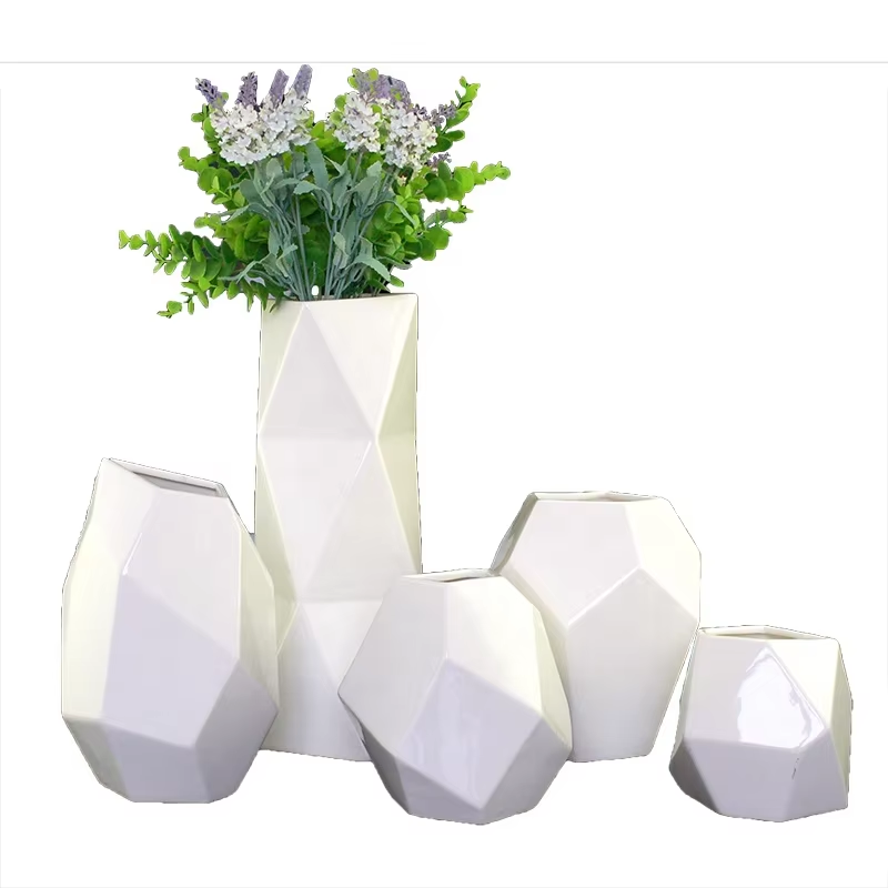
Ceramic vases in neutral colors act like silent sentinels in modern homes, anchoring the space with their understated presence instead of shouting for attention. White ceramics bounce around the natural light, making small rooms feel bigger when placed among all those sleek lines and empty surfaces. Light gray options work wonders too, creating just enough contrast against concrete floors or marble counters without clashing. Think about terracotta, beiges that remind us of desert sands, or earthy tones that bring a piece of the outdoors inside. According to some research published last year, spaces decorated with these kinds of clay-colored ceramics got rated about 30% more peaceful than rooms filled with plastic or metal decor. These vases don't fight for attention, letting the architecture and fancy furniture shine instead. The matte finish on many of them adds another layer of authenticity that people really appreciate in nature-themed spaces. A good white or clay vase can handle almost anything seasonal changes throw at it, holding fresh eucalyptus branches in summer and dried grasses during winter months. This means fewer trips to buy new decorations throughout the year, which is great for both wallets and the environment. When arranging multiple vases together, mixing different heights within a single color palette creates visual interest without overwhelming the eye. Try pairing a unique shaped clay pot with some old wooden shelves or flooring for extra character.
Bold Ceramic Vase Colors: Strategic Accenting Without Visual Overload
Turquoise, Emerald, and Mustard â High-Impact, Low-Risk Accent Colors for Contemporary Living Areas
Ceramic vases with bold colors make great statement pieces if used thoughtfully rather than overdone. Think turquoise for that beachy vibe, emerald green for a touch of nature's richness, or mustard yellow to bring warmth into a space. These shades work really well alongside wooden elements and plants that are so popular in contemporary interior designs today. The trick is moderation though. We're talking about using these vibrant colors on maybe 10% or less of what's visible in a room according to design principles. This careful approach taps into how colors affect our moods without making eyes tired, unlike those garish synthetic colors we sometimes see. Ceramic itself has this earthy quality that keeps even bright colors from feeling too intense. Glossy surfaces make colors pop against matte backgrounds, and some cracked glaze effects add that nice old world charm. Place one strategically on a simple console table next to a drab couch or somewhere in a mostly single-colored corner, and suddenly it becomes a standout piece without fighting for attention from walls or furniture.
How Glaze Finish and Ceramic Texture Influence Color Perception in Modern Settings
Matte, Glossy, and Textured Surfaces: Their Effect on Light, Depth, and Spatial Balance
The way a ceramic vase looks has everything to do with its glaze finish and surface texture. When we talk about color perception, these factors really matter for how the piece fits into a space. Matte finishes tend to soak up light instead of bouncing it around, which makes colors look less intense and gives neutral tones a calm, grounded feel that works well in minimalist interiors. People have been buying more matte glazed ceramics lately too â industry reports point to about a two-thirds increase since last year. This trend seems to come from folks wanting something with character (those natural textures) plus the practical side of things like not worrying about fingerprints showing as much. Glossy surfaces work completely differently though. They bounce back all that ambient light, making colors pop out more vividly. Turquoise becomes deeper blue, emerald greens seem richer, and whites take on that crisp, clean look. But there's a catch here. Those shiny surfaces need smart placement so they don't create annoying glare spots or overwhelm open spaces where reflections already run rampant. Then there are textured options â ribbed surfaces, carved details, maybe even some crystal-like effects. These scatter light in all sorts of interesting ways, creating those moving shadows that give depth to otherwise flat color schemes. All told, different finishes change how we experience space. Matte tends to pull things back visually, gloss makes rooms feel bigger, while textures create points of interest that draw the eye. Getting this right means ceramic vases aren't just sitting there looking pretty. They actually help define the atmosphere of a room through their interaction with light and space.
Practical Color Coordination Systems for Styling Ceramic Vases
Applying the 60-30-10 Rule to Ceramic Vase Selection in Monochromatic and Layered Interiors
When it comes to adding ceramic vases to modern spaces, many designers still swear by the old 60-30-10 ratio thing. Basically, 60% of what's in the room should be the main stuff like walls and big furniture pieces. Then throw in another 30% for things like rugs and curtains. And save that last 10% specifically for those special accent items we're talking about here. For rooms that stick mostly to one color, pick vases that match the base color but play around with different finishes. Matte white ones next to glossy gray surfaces work really well, or maybe something with texture like ribbed clay. If the space already has multiple colors going on, that 10% becomes super important. Think about putting in a terracotta vase when the walls are sage green, or maybe a bold cobalt blue piece in a room with charcoal and cream tones. Getting this balance right keeps everything from looking too cluttered, and makes sure each vase actually contributes to how the whole space feels instead of just sitting there randomly.
FAQ
What are the best neutral colors for ceramic vases?
White, light gray, and natural clay tones are considered the best neutral colors for ceramic vases, as they blend well in minimalist and biophilic spaces.
How can bold colors be used effectively in decorating with ceramic vases?
Bold colors like turquoise, emerald, and mustard can be used as strategic accents in home decor by applying them to a small portion of visible space, following the principle of moderation.
How does the glaze finish of a ceramic vase affect its appearance?
Matt finishes create a calm and grounded feel, glossy finishes make colors pop, and textured surfaces add depth to the design by scattering light.
How do I use the 60-30-10 rule for styling ceramic vases?
This rule suggests allocating 60% of the space to main items, 30% to secondary decor, and 10% to accent pieces like ceramic vases for balanced design.